I’m excited to show you the graphics that Kevin Wiley did for me for the Stolen Season CD release. 🙂 Kevin always does swift and gorgeous work, and he’s really pulled out all the stops this time! He and I have worked together for over ten years now, and I’m so glad to have his help with graphic design once again.
Art contributed by Elizabeth Jordan Leggett (she’s up for a few Hugos, so be sure to check out her nominated pieces if you’re eligible to vote for the Hugo Awards this year!) and Chaz Kemp, both of whom are fine people who are a delight to work with.
Photos contributed by Kirk Lanier and Sandra Buskirk, both of whom are amazingly talented, and who know talent in turn when they see it.
I’ll have pre-orders up at the store link as soon as I can! For now, feast your eyes, and if you haven’t listened to the pre-mastered mixes yet, you may do so at this link whenever you like! The art is under the cut for those of you viewing this post on my “Welcome” page. Just click “more”.
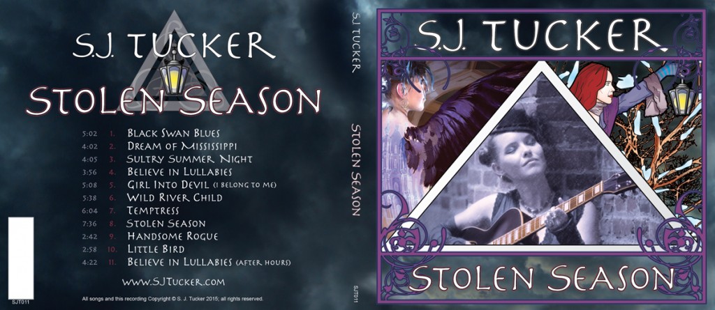
^This is what the front and back covers will look like. The white space is for the barcode, which my replication company, Audiographic Masterworks, will add in. We ended up with rather more beautiful art than we’d first planned for for this project, so for the cover, Kevin wove together one of Elizabeth’s pieces (inspired by “Black Swan Blues” and one of Sandra’s photos), one of Sandra’s excellent photos, and Chaz’s art (inspired by “Stolen Season” and one of Kirk’s photos).
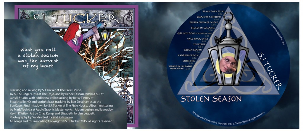
^This is what you’ll see when you open the digipak and look inside. The round bit is the CD label, with my face in one of Sandra’s photos peeking out from beneath the clear plastic tray. Chaz’s art is featured again on the front of the CD booklet, which will live in a diagonal pocket as shown.
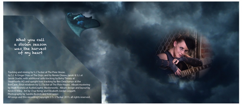
^This is what the inside of the CD packet will look like with the disc and the paper booklet taken out. Art by Elizabeth (inspired by “Handsome Rogue”), photo by Sandra.
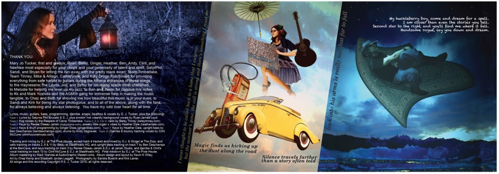
^This is how the inside of the booklet will look when you unfold it. Photo by Kirk, art by Elizabeth (inspired by “Dream of Mississippi” and “Handsome Rogue”).
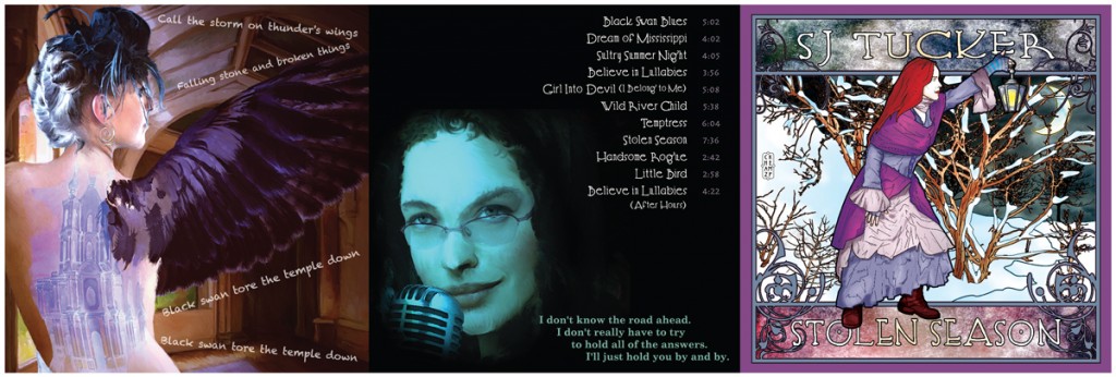
^This is how the other side of the unfolded booklet will look. Art by Elizabeth (inspired by “Black Swan Blues” and “Believe in Lullabies” – I love both of these pieces so much) and Chaz (inspired by “Stolen Season” – the first piece of art for the album, and the official promo piece).
I am immensely pleased with how the look of this album has turned out. I hope you like it, too!
